Selecting a colour or colour scheme for your logo and brand image is just as important as the logo design. I like to think of the logo colours and the logo design as a cohesive marriage. The two form a unified union, just like partners in a relationship. The combination and mixture of these two components need to work well together to successfully create a meaningful logo design for your company and logo brand image.
In this article I’ll discuss how you can select colours and colour schemes that will complement your logo design and further enhance your message, convey meaning and enhance your brand image. Colour and colour schemes should be used as an extension of your brand image and used to convey your logo mood.
Colour scheme is a form of art that’s used to convey a message, mood and feeling
I love color! It’s one of my favorite components of the logo design process. When the selected colour scheme is used correctly, it can transform the logo and take the design to a whole new level. Using color in your logo design you can convey a mood, grab the viewer’s attention, make a statement or tell a story.
By selecting the right colour or combination of different colours you can create your desired mood and message. What ambiance do you want to convey? Excitement, joy, tranquility, energy, peacefulness, calmness, fun or seriousness… These emotions and moods can all be successfully achieved by selecting the right colour or colour schemes that will amplify your message and portray your brands message to your viewers.
Below I’ve showcased several examples of our own logo design work to show you how we’ve used colour and various color schemes to set a tone, convey a message and create a mood.
Logo Example #1 – Lady Fair Dermatology Colour Scheme
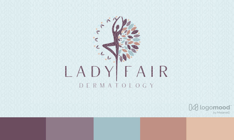
The Logo Meaning: In this example, this logo is for a spa/beauty brand. The logo image depicts a beautiful and delicate design of a woman’s silhouette figure. Her arms and body formation are stylistically designed and positioned in a spiritual and uplifting manner. The extension of the woman’s leg create the impression of a tree trunk with a leaf pattern arranged in a circular design that encompass the figure, while also representing the leaves of a tree.
How colour is used to set the logo tone, convey a message and create a mood: To capture the natural, tranquil essence of the logo design we used a colour scheme of softer, muted color palette. We wanted to capture the relaxing, spiritual, calm and feminine environment. We selected muted violets shades to create the spiritual mood and main color of this logo design with soft, pastel accent shades of blue, which represents calmness and meditation, and pink/taupe shades to tie into the feminine appeal and target for this logo. Softer, muted colors are used to create a relaxed and calming affect, perfect for spiritual spa and realization retreat logos like this example.
Logo Example #2 – Wholehearted Daycare Center Colour Scheme
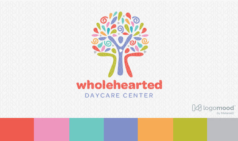
The Logo Meaning: Vibrant, bright and energetic tree people logo featuring three stylized people figures that form the tree trunk with bursting tree leaves that create the canopy of the tree.
How colour is used to set the logo tone, convey a message and create a mood: This logo is for a children’s daycare & we wanted to capture the free-spirited, fun message by selecting multiple colors that are bright, vibrant & energetic. Vibrant colour scheme creates a high-energy look that ignites excitement and joy. The bright array of colors successful projects a dynamic and joyful mood, which ties in perfectly with the whimsical and spirited imagery depicted in this logo design.
Logo Example #3 – Capital Legal Firm Colour Scheme
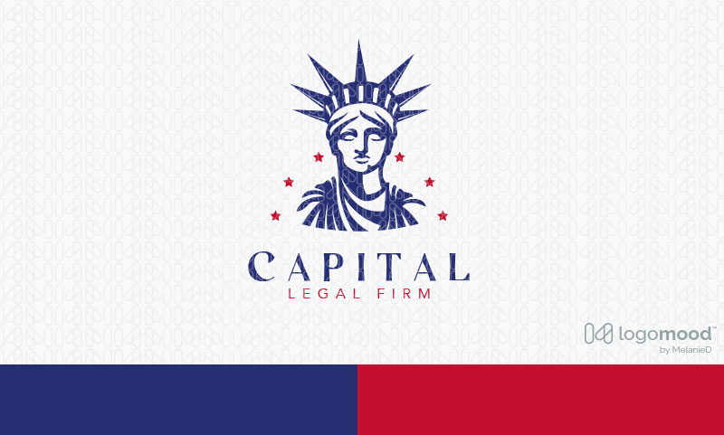
The Logo Meaning: Bold and dynamic rendition of the Statue of Liberty. Clean bold lines are used to create this visually impactful, bold and patriotic Statue of Liberty logo design.
How colour is used to set the logo tone, convey a message and create a mood: Sometimes a design colour scheme is better suited with the use of only one or two colours. This logo design is an example of a logo that simply uses two colours to effectively convey the message. The iconic bold blue and red are use to efficiently convey the patriotic theme of this logo design. The blue is commonly used in corporate logos as blue represents authority, loyalty and professionalism.
Logo Example #4 – Forge Fit Cross Training Colour Scheme
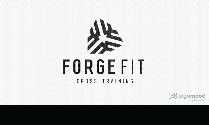
The Logo Meaning: Bold, clean and abstract logo design that’s created with geometrical shapes, merged together to create this shield-like logo design with three connecting pointing arrows that point to the center of the logo icon.
How colour is used to set the logo tone, convey a message and create a mood: This is a logo design example that uses a colour scheme that’s only black and no other colors. This logo is for fitness cross training company. Black was selected because visually it’s powerful, bold and strong. We wanted the logo to have a lot of impact and boldness so we selected the black for its authoritative and powerful properties.
Logo Example #5 – Americano Luncheonette Colour Scheme
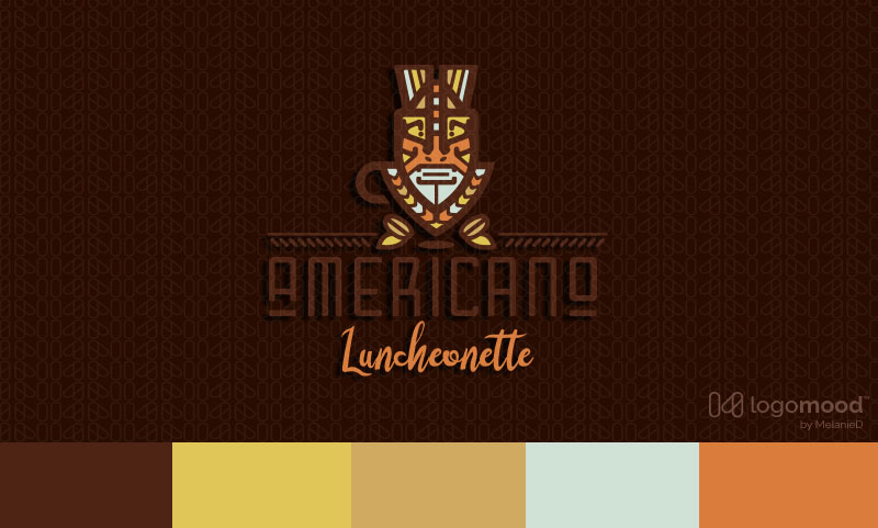
The Logo Meaning: Modern, bold tribal themed coffee logo design featuring a unique Indian tribal mask. An abstract coffee cup is incorporated into the bottom portion of the mask with coffee beans and leaves framing the logo design. The style of the logo is unique and modern with a distinctive tribal look.
How colour is used to set the logo tone, convey a message and create a mood: This is a logo design uses a warm earthy colour scheme to portray the Native American tribal face paint theme depicted in the design. The colours selected add warmth and harmony, while capturing the essence and feeling of the Native American art, traditions and culture.
Logo Example #6 – Natural Elements Colour Scheme
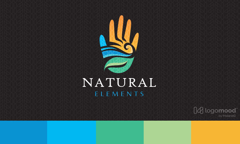
The Logo Meaning: Natural and modern hand logo design with the hand created with the earth’s elements of wind, water, earth, sun and fire. The earth elements are beautifully incorporated into the hand design to create a seamless, distinctive logo design.
How colour is used to set the logo tone, convey a message and create a mood: In this example colour is used to represent each of the natural earth elements. Blue representing sky and water, yellow representing the sun/fire and green representing the land/earth. The selected colours further enhance the visual design with the bright, vivid colours used in this logo design to delivery a powerful healing message.
Logo Example #7 – Astraea Legal Law Firm Colour Scheme

The Logo Meaning: Beautiful, elegant and sophisticated legal law logo. Logo features a woman figure designed to represent Astraea, the ancient goddess of law and justice. The woman goddess is designed to represent the scales of justice with her hands outward, holding each scale. The scales represent the claims of opposing parties in disputes.
How colour is used to set the logo tone, convey a message and create a mood:
The golden colour scheme is selected for the logo because we wanted to add richness and warmth to the logo. The golden colour achieves this desired look. Also, the gold colour further enhances the sophisticated style and elegance of the logo design. The golden spectrum evokes luxury, class, and sopstication, while also represents quality, prosperity and value. The colors also add depth to the logo piece.
Lisa & Melanie
Designers & LogoMood Co-founders